Monday, 9 January 2012

The international style - Alphonse Mucha.

Coming from the Czech republic, Alphonse Mucha was an artist who specialised in an art nouveau style. Mucha's works frequently featured beautiful young female figures in flowing, robes, often surrounded by pretty flowers and elaborate geometic designs that sometimes formed halos behind their heads. I really like the work of Mucha, because of his use of pastel colours and the realism he manages to give to his figures without losing his sense of style. The Mucha style was spread internationally in the 1900 exhibition.


One of the major formal inspirations for art nouveau was the idea of using nature as inspiration for design. Using flowing lines and very natural shapes. Mucha believed very much in carrying on the artistic traditions of his ancestors, his commitment to his culture is something I admire because I’ve developed my own sense of national pride as I’ve developed a deeper interest of British history.

His belief that we should take the time to look back on the old as well as move forward into the new is also a refreshing idea, it gives us an opportunity to learn from history's mistakes (and to make the same ones if it pleases us!)

I hope someday to help move British art and storytelling forward, by documenting the past and studying the history of each of the home nations and Mucha helps me feel very strong about it and more determined to one day achieve it. I should probably start by working harder.

Mucha also hated to be regarded as a Frenchman, a pain I’m sure we can all empathise with. He also hated the way Czech art was becoming more German and spent a lot of time and energy getting it back to it’s roots, making himself a defender of what it meant to be Czech in Chezh culture.

 Good show, what, what.

http://records.viu.ca/~Johnstoi/praguepage/muchalecture.htm


Postmodernism.

Post-modernism is all about challenging our perceptions of things, male and female, black and white,  straight and gay,  it regards them as social constructs that can be altered and changed by time and context, held together only with language. Language is central to Post-modernism and it challenges any ideas of severe categorisation, power relations and our motivations.

Not limited to art, Postmodern is an idea that can be applied to anything, refusing to believe in the  idea of things being fully explained.

Like the futurists the post-modernists believed that the art of yesterday was in the past, that we should only look forward. Text was often disjointed and disconnected, making no sense except in terms of layout. But it at least knew that it was a shallow and endlessly repeatable, undermining the idea of high art and seeking to disprove it completely. Not allowing for elitism yet holding onto it's own sense of elitism.

http://www2.iath.virginia.edu/elab/hfl0242.html
http://www.youtube.com/watch?v=oL8MhYq9owo

Sunday, 8 January 2012

Preliminary notes, and my feelings. (I have no idea.)

The futurists.
An art movement started up in Italy, founded on a principle of Chaos, industrilisation and technological upheaval. They indulged the idea of war and went on to protest Italy’s neutrality during the war and in 1915 when the war eventually came many futurists signed up to fight in the war. A mark of courage I feel, and perhaps a reason to respect the futurists otherwise sexist and anti-intellectual attitudes.

While Sexism was nothing new and not specific to the futurists, it’s hard in these modern times to overlook the negative aspects. Perhaps an unfair opinion that we can’t help feeling with our more modern sensibilities.

The futurists also believed in the idea of anything old being wiped away and destroyed., disregarding the rules and tearing down libraries. Society and in conjunction art, cannot move forward and improve without looking to the past and knowing what works.

The pursuit of the new is not a bad thing, but it must go hand and hand with referring back to what we know to work and to improve upon it. That is my main complaint with the movement as a whole but it is not a complaint that takes away from my understanding of what it was Futurism was about.

It was about moving forward, seizing new ways of using materials and throwing aside anything deemed too old fashioned to be of value. It was a valuable step in terms of art movements and it set the foundations for what came after but my more modern mind has a hard time seeing past what I think are obvious flaws and for that I can say pretty conclusively that I am no futurist.

Beautiful losers:

A bunch of American kids/adults try and look artistic by drinking and putting graffiti on everything.

I am all down with graffiti, but there’s something lazy about this I cannot stand. I admit that a lot of the art produced was good, but it seems somehow juvenile and pretentious.

An undercurrent of the belief that one requires a messed up childhood or a life on the street to truly appreciate art. Anybody can make art and anybody should make art. If it’s an outlet for your inner most demons that’s pretty cool too, but these demons are not restricted to a bunch of middle class Americans and I somehow got the impression that it’s what they were implying.

People can work for years to perfect their art and get no recognition at all, but these clowns set up a ‘gallery’ and drink and suddenly they’re all serious artists?

It was distinctly American in tone and perhaps that is what put me off.

It did have a playful and childish outlook, which was a little refreshing, but so much of it was childish to the point of mindlessness that it really doesn’t seem like it deserved to be shown at all. There were a few artists who seemed genuinely talented and they were a little lost in it all.

The constructionists.

As with most of these art movements from around this time they were young, avant garde with guts and vision and most of them I assume were 20 year old Russian men.

While they sought to build things, use an architectural philosophy as a foundation towards their art they certainly didn’t think small, hoping to build something bigger that the eiffle tower and more ridiculous than a helter-skelter made of knitting needles, that’s rather amazing.

The painting however is not really my favourite thing,  I’ve never really understood this obsession with geometric shapes. I do like the concept of pure thought, and they did sort of kill painting in a sense (it seems to be taking the news okay so no damage done.)

I feel like I have some admiration to these guys, they wanted to build something huge that spins, express pure thought, rotate things slightly and generally just try and outdo the French, which I think I can approve of.

And all that in 1919. Good stuff.

The constructivists and their bid to annoy the French.

The constructivists believed that art should be straight forward and describe without metaphor or indulgence the workings of the world around them. They saw the act of using colour as inherently wrong, as the essence of a thing is not merely about it’s colour. The essence of a thing is merely how it looks and acts. The manifesto of the constructivists calls into question the legitimacy of the beliefs brought on by the futurists, seeing them as inherently old fashioned, but a vital and important step towards  progression.

They also had a strong belief in justice, a sense of fairness that was lacking from the more aggressive manifesto of the futurists.

Mainly a Russian phenomena, one of the most impressive ideas the constructivists came up with was never realised, a massive rotating building, larger in scale than the Eiffel tower and designed as a symbol of a newer, better Russia after the revolution. Designed by Vladimir Tatlin, it's a shame he never actually got a chance to make it. Look at this thing. It was an impressive, slightly insane, mass of metal, and could have been used as a helter skelter.


It was also designed to rotate,  which is pretty hardcore considering we’re talking about something designed before the 1920’s.

http://va312gulcebaycik.wordpress.com/2010/12/11/constructivism/
http://magus71.wordpress.com/category/the-realists-manifesto/
http://web.mac.com/davidrifkind/fiu/library_files/gabo.the-realistic-manifesto.lib-iss.pdf

Bauhaus

In 1919 the Bauhaus was an institution for some of the most prominent architects, designers and artists of their time when . Founded by architect Walter Gropius, the school is characterized as having "geometric design, craftsmanship and a respect for materials. Johannes Itten developed his theories on the colour wheel, showing complimentary colours as well as being a mixing guide. Using this theory we can easily choose colours and make educated selections about how to use it. We can also use it to avoid colours that clash (Unless we particularly want to create a heavy contrast)


Such as with this piece from the Cold War Modernism Era: 


The blue, red and yellow all stand out and compliment each other, while the green clashes a little more with the yellow, drawing the eye to the middle of the image. but it is used in moderation. I'm not very good at using colour theory in my work and would like to use it a little more. 


ColdWarModernism.


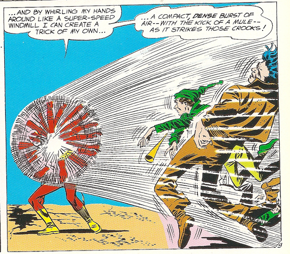
The point of this piece was to show the movement of the limbs of the dog as it walked. This creates a multi limbed movement illusion that is reminicent of many comic books and strips:

such as this flash comic, a product of the 1960's and showing some similarities to the dynamism to a dog on a leash with it's portrayal of movement. Though the composition and colour scheme are different. It leads me to thinking of this piece:

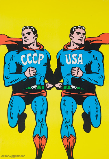
 Used during the cold war to illustrate the rival versions of Superman in Russia and the USA, there's no difference between the two, merely mirroring each other. An expression of how art was used (but not central to) in representing what was going on. Representing the two as heroes seems a little off, considering the capacity of both Russia and America to ending the world with nuculeur weapons.


The CCCP USA Supermen Original Cold War Poster is very simple in design, with no more than eight flat colours, black adding the shadows and a use of complimentary colours, and a bright eye catching background.

http://www.jayhosler.com/jshblog/wp-content/uploads/2011/12/flash106.jpg
http://www.dpvintageposters.com/cgi-local/detail.cgi?d=2468